Archives for category: Graphic Design School

Written by Albert Bitterman, with illustrations by Chris Raschka

Oh I love me some Chris Raschka illustrations. And these might be some of my favorites. This time they are housed in an interactive book with a charming story; something about them shines in Fortune Cookies. This is Albert Bitterman‘s first book. And what a book! A book that itches to be read aloud, a book with a message that doesn’t suck and some really cute kittens and a little girl, a book to be proud of. And worthy of the rockstar illustrator Raschka, too.

In school they always tell us to do our research, read the copy before we select a font and lay it out, know who said that quote we’re putting on a poster and why. Immerse yourself in the company you’re creating an identity for.

Blogging is somewhat less serious than that, to be honest. It’s late, I should be in bed, but I decided to post first. And I could have rushed it. I almost clicked past it. But in the end, I’m glad I did my research, and read the article I almost dismissed about bookseller Pete Cowdin.

He’s a bitter bookstore owner in Kansas City, co-owning children’s book shop Reading Reptile with his wife Debbie. He hates the same megagiant predatory bookstore that I do (as an independent bookseller, how could you not?), he wishes that children’s books were taken more seriously and given real criticism. This guy is awesome. And he can write. So congratulations Mr. Cowdin, or Mr. Bitterman. You’re an inspiration to all of us bitter children’s booksellers out there, especially the writerly ones.

Oh, I love it! I do, I want to read this one aloud.

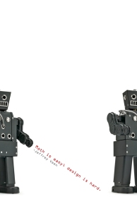
Jeffrey Veen

Poster Design for Poster Design class

I used a robot I found here via Google. I didn’t make it or take it’s picture. Someone else did. And they did a good job of it. The typeface is OCR-A, designed by Swiss designer Adrian Frutiger.

Jeffrey Veen is a web developer who helped create MeasureMap, an analytics tool that Google acquired, and Typekit, an invaluable tool for web designers who don’t want to sacrifice good typography.

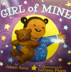
This entry is about two board books of differing quality. One, I love, the other, I have much disdain for. Both display a mighty disrespect for tasteful typography. The first, the one I love, is Girl of Mine, by Jabari Asim, with gorgeous illustrations by LeUyen Pham. I love it. I sell it all the time. It is a companion to Boy of Mine, a similar title. Asim and Pham have also co-produced Whose Toes are Those and Whose Knees are These, more board books, also well loved and sold in the bookstore I work at. My confusion is with the type. First of all, I’m not crazy about the typeface. But I see why it was chosen and can forgive … someone for that. Why is it that on the first few pages, the type is simple and black, and then switches inexplicably to having a white stroke around it with a dropshadow? Rules are made to be broken, but I’m pretty sure my favorite teachers would have a fit if I turned something like that in. Why the inconsistency? As far as I can tell, the mutated letterforms are less legible with all the accessories they’re wearing, so why do it at all?

And now Good Night Seattle, by Jay Steere with illustrations by Joe Veno. People ask for it all the time. I steer them towards something else of slightly better quality that achieves the same goal. They buy this one anyway because they’ve heard good things about it. They’ve heard about it because these guys have a book for every major city in the States. They’ve heard of it because it’s as generic as books come. It’s familiar to them because it’s TYPESET IN COMIC SANS. I’m sorry to caps lock, there, but if I say anything else it will be offensive and I will feel bad. Because I am nice.

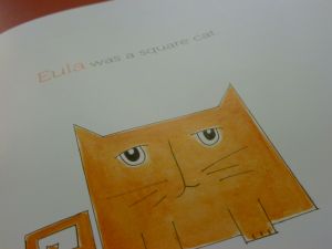
square cat by elizabeth schoonmaker

The book that started it all.

I was at work, at the bookstore where I have worked for the past 5 and a half years. It was about 20 minutes to close. I saw this book and exclaimed “Museo!” then checked the copyright page to check my skills. Correct in my typeface identification, I then allowed myself a peek inside the book.

You see, I am a nerd. As a design student, I can hardly remember the  days when an ugly sign might have escaped my notice, or Papyrus on a cocktail menu or Yoga studio did not elicit a sneer. A good friend and classmate often warns first years at our school “you can’t turn it off.” He’s right. I can’t turn it off. It just gets worse and worse. But it’s also more and more satisfying. Noticing things. Knowing what’s wrong with it, knowing how you’d fix it.

In any event, after looking at Elizabeth Schoonmaker’s “Square Cat,” thinking it was cute (but not nearly as cute as the other books I’m excited about writing about on this blog, sorry, Elizabeth—I do like the illustrations), then impulsively taking photos of the book and other recent favorites around my section, I started this blog. So that’s that. I’m gonna write about children’s books, illustration, graphic design and who knows what else. What a night.